| Invention Name | Manuscript Illumination |
| Short Definition | Handwritten books enhanced with painted decoration and, in many cases, reflective metal (often gold) to add visual structure and prestige. |
| Approximate Date / Period | c. 400–1500 CE (peak in 13th–15th c.) — Approximate |
| Geography | Mediterranean; Europe; later broader cross-cultural traditions |
| Inventor / Source Culture | Anonymous / collective; workshop traditions (monastic, court, urban) |
| Category | Book technology; visual communication; art craft |
| Importance |
|
| Need / Reason It Emerged | Navigation in dense texts; authority; devotion; gifting |
| How It Works | Pigments + binders on parchment; metal leaf/powder for light-catching highlights |
| Material / Technical Base | Parchment/vellum; inks; mineral/plant pigments; gold leaf; burnishing |
| Early Main Uses | Liturgical books; prayer books; learned reference volumes |
| Spread Path | Scriptoria → courts → city workshops → collectors and libraries |
| Derived Developments | Page design conventions; ornament in early print; heraldic and emblem systems |
| Areas of Impact | Education; art; administration; culture |
| Debates / Different Views | Multiple early centers; “first” examples vary by definition — Debated |
| Predecessors + Successors | Decorated scrolls → illuminated codices → printed illustration + modern book design |
| Key Traditions | Byzantine; Insular; Carolingian; Gothic; Renaissance |
| Types Influenced | Initials; miniatures; borders; marginalia; calendars; canon tables |
In the history of books, manuscript illumination stands out as a visual language built for the page. It made long texts easier to move through, helped readers find meaning fast, and added a sense of value that ink alone could not carry. Gold and color did more than decorate; they shaped how a reader’s eyes traveled, what felt important, and what stayed in memory.
Table of Contents
What Manuscript Illumination Is
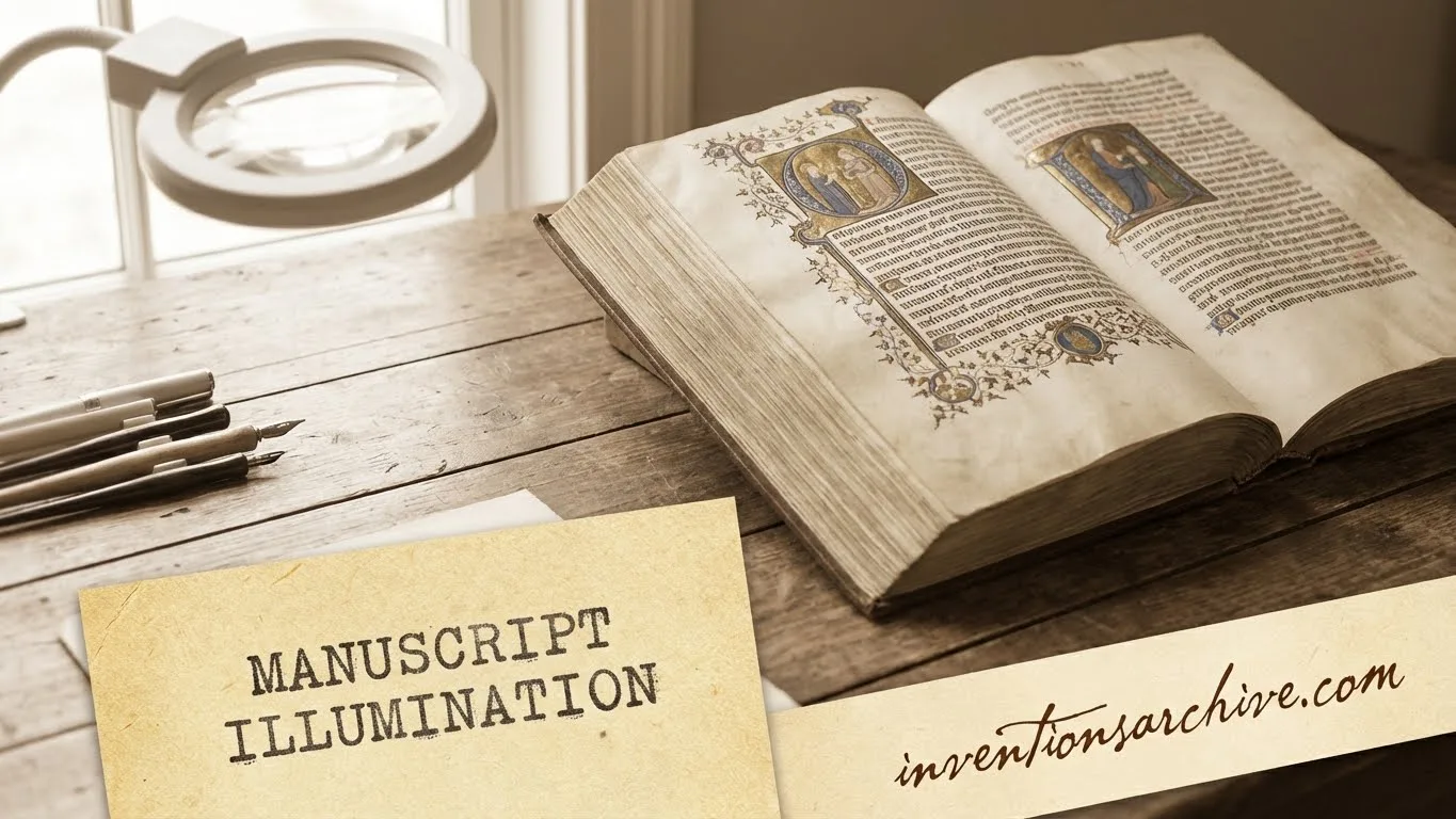
Illuminated manuscripts are handwritten texts enriched with designed and light-catching elements—often gold—so the page seems to “shine.” In its older sense, “illuminated” connected directly to decoration with gold leaf, then broadened to include many kinds of manuscript imagery and ornament.Details
- Initials that signal a new section, often with pattern or figures
- Miniatures (small paintings) that anchor meaning with scene and symbol
- Borders and line-end ornaments that guide the eye across the page
- Marginalia that add commentary, wit, or visual rhythm without breaking the main text
- Color systems that separate voices, headings, prayers, or references
Why It Mattered
Manuscript illumination solved practical problems while delivering symbolic power. Readers needed clear landmarks in dense pages, patrons wanted visible quality, and communities used books as durable carriers of learning and identity. It worked because decoration was not random; it was structured, placed where meaning and navigation met.
Reading and Navigation
- Section signals through initials and borders
- Visual cues for headings, names, and key passages
- Fast scanning without losing the text’s logic
Authority and Value
- Gold and silver announce importance
- Skilled labor signals investment and care
- Books function as gifts and heirlooms
Memory and Meaning
- Images reinforce stories and concepts
- Color supports mood and emphasis
- Repetition of motifs builds recognition
In many collections, the most ornate decoration appears where readers most needed it: beginnings, divisions, and moments that demand attention. Illuminations could be made with gold or silver leaf or powder to reflect light, while initials, illustrations, and borders helped mark structure and guide engagement with the text.Details
Materials and Visual Effects
The craft rests on a material stack: a writing surface, inks, paints, and reflective metal. Each part changes how the page behaves under light. A matte pigment absorbs; a burnished metal highlight throws light back, creating that spark associated with illumination.
| Component | Role on the Page | Typical Notes |
|---|---|---|
| Parchment / Vellum | Stable surface for ink and paint | Smooth, durable, prized for clarity |
| Ink | Text, outlines, fine detail | Dark lines set the structure |
| Pigments | Color fields and shading | Mineral, plant, and synthetic sources |
| Binders | Hold pigment to the surface | Thin layers keep forms crisp |
| Gold / Silver | Reflective highlights | Leaf, powder, or shell gold effects |
Even small choices mattered. A brighter blue can pull focus toward an initial; a thin border can keep a paragraph visually contained. Many manuscripts also used repeating patterns to create rhythm across a long book, helping the reader feel where they are, even when the text is dense.
How the Craft Worked
Manuscript illumination was rarely a single-person task. It moved through stages, with planning before decoration, and decoration often before final finishing. The order mattered because metal leaf and paint can interfere with each other when placed at the wrong time. The result, at its best, is a page where text and image feel locked together.
- Layout: ruling lines and spaces reserved for initials and images
- Drawing: outlines that define the miniature, border, or letterform
- Gilding: metal areas prepared, then applied and burnished for shine
- Painting: color laid in layers, from broad areas to smaller forms
- Detailing: fine linework, highlights, and visual punctuation
Common Visual Building Blocks
- Decorated initials: letterforms turned into design anchors
- Historiated initials: initials containing a scene or narrative figure
- Inhabited initials: initials filled with figures or creatures
- Full-page miniatures: images that function like a visual chapter opening
- Border programs: repeat motifs that unify pages and sections
Timeline and Milestones
The tradition is long, and the “start date” depends on definitions. One clear anchor is the survival of substantial examples: some of the earliest surviving major illuminated manuscripts are associated with the early Eastern Christian world and are dated to about 400 (with examples noted in a Byzantine context).Details
- 6th–8th centuries: regional styles sharpen; complex ornament and bold initials become key navigational tools
- 9th–10th centuries: court and monastic programs strengthen; page design grows more systematic
- 12th century: large initials and structured decoration flourish; books read more like organized “maps” of text
- 13th–15th centuries: urban workshops and specialist production expand; prayer books and personal volumes spread among elites
- 16th century: commissions continue even as print rises; illuminated luxury remains attractive for private devotion and prestigeDetails
Types and Variations
“Illumination” is not one look. It ranges from restrained decoration to pages saturated with color and metal. Many traditions developed their own visual rules, shaped by local taste, available pigments, and how books were used.
By Density of Decoration
- Rubrication: selective red ink for headings and initials; low cost, high clarity
- Pen-flourished initials: line-based ornament that stays light and readable
- Illuminated initials: initials with gold, color, and strong visual weight
- Miniature-led pages: imagery drives attention, with text arranged around it
- Full programs: coordinated borders, calendars, initials, and miniatures across the book
By Placement on the Page
Within Text
- Initials at openings and major divisions
- Line fillers and small motifs that tidy the margin
- Small scenes embedded near relevant passages
Around Text
- Borders that frame the page
- Marginalia that expands meaning without interrupting
- Repeat motifs that unify sections
Regional Traditions
Across regions, the same core idea appears: a book becomes more usable and more valued when text gains signals and imagery gains structure. Styles differ in pattern, figure, and palette, yet many share familiar elements such as luminous initials, page framing, and narrative miniatures.
- Byzantine: strong icon-like presence; rich gold backgrounds and devotional intensity
- Insular: complex interlace and energetic letterforms built for impact
- Gothic: refined linework, elegant borders, and compact visual rhythm
- Renaissance: classical motifs, spatial depth, and painterly finish
- Islamic and other traditions: sophisticated geometry, calligraphic emphasis, and precise ornament
Legacy in Modern Visual Communication
Many habits of modern page design echo manuscript illumination. The idea of “where the eye should land” is built through hierarchy: big initials, clear starts, controlled margins, and repeated motifs. Even without gold, the logic remains: signal the important parts, keep the page legible, and make the reading path feel intentional.
- Typography: initials and headers as visual anchors
- Layout: margins and frames that stabilize dense text
- Iconic imagery: small pictures that compress meaning into one glance
- Collecting and preservation: libraries and museums treat illuminated leaves as key evidence of book history
FAQ
What makes a manuscript “illuminated”?
A manuscript is typically called illuminated when decoration uses reflective metal (often gold) or employs a rich decorative program that gives the page a luminous presence.
Did illuminated manuscripts always use real gold?
Many high-end examples used gold leaf or gold-based paint, while more modest books relied on color, ink ornament, and careful design to achieve emphasis.
Why are initials so prominent in manuscript illumination?
Large initials act as navigation markers. They separate sections, highlight openings, and help a reader locate key parts quickly, especially in long texts.
How did illumination change once printing spread?
Printed books took over routine reading needs, yet luxury illumination stayed attractive for prestige and private use, especially in elite devotional volumes.
How are illuminated manuscripts preserved today?
Preservation focuses on stable storage, careful handling, and controlled light exposure so pigments and metal layers remain clear and intact.